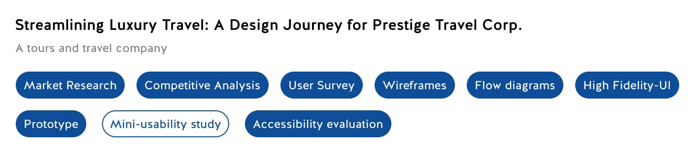
Transforming a premium travel booking platform with intuitive user experience, accessibility-first design, and elegant visual aesthetics.
Client
Prestige Travel Corporation
Industry
Luxury Travel & Tourism
Timeline
12 Weeks
Services
UX Research, UI Design, Prototyping
Prestige Travel Corporation approached us with a critical challenge: their existing booking platform was driving potential customers away. Despite offering exclusive luxury travel packages, their website suffered from poor user experience, confusing navigation, and accessibility issues that failed to meet modern web standards.
The old platform had a 68% bounce rate on the booking flow, with user testing revealing frustration around finding specific destinations, comparing packages, and completing reservations. For a premium brand targeting affluent travelers, the digital experience was undermining their market positioning.
Original Bounce Rate
68%
Mobile Usability Score
42/100
Accessibility Issues
37 Critical
Avg. Time to Book
14 minutes
We began with comprehensive user research to understand the needs, behaviors, and pain points of luxury travelers. Through interviews with 24 existing and potential customers, we identified key frustrations: unclear pricing, overwhelming choices without proper filtering, and lack of trust signals during the booking process.
Competitive analysis revealed that leading travel platforms were investing heavily in visual storytelling, personalized recommendations, and streamlined checkout flows. We also conducted accessibility audits, uncovering significant barriers for users with disabilities.
User Interviews
24 Participants
Competitors Analyzed
8 Platforms
Usability Tests
3 Rounds
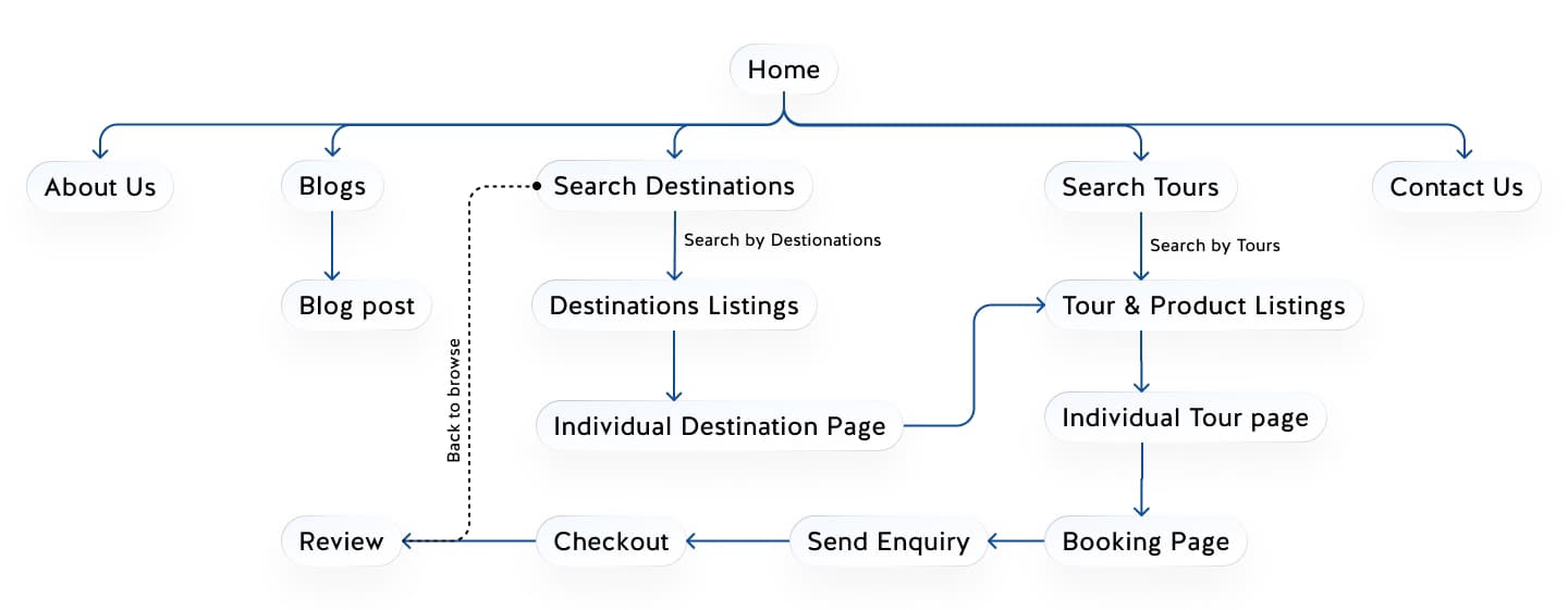
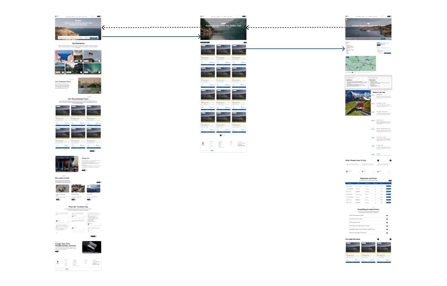
Our design process followed a user-centered methodology, starting with information architecture restructuring. We reorganized the entire site hierarchy to reduce cognitive load and created clear paths for different user goals: browsing inspiration, researching specific destinations, and completing bookings.
The visual design evolved through multiple iterations, balancing luxury aesthetics with functional clarity. We established a refined color palette, elegant typography, and generous white space to create a premium feel while maintaining excellent readability and usability.
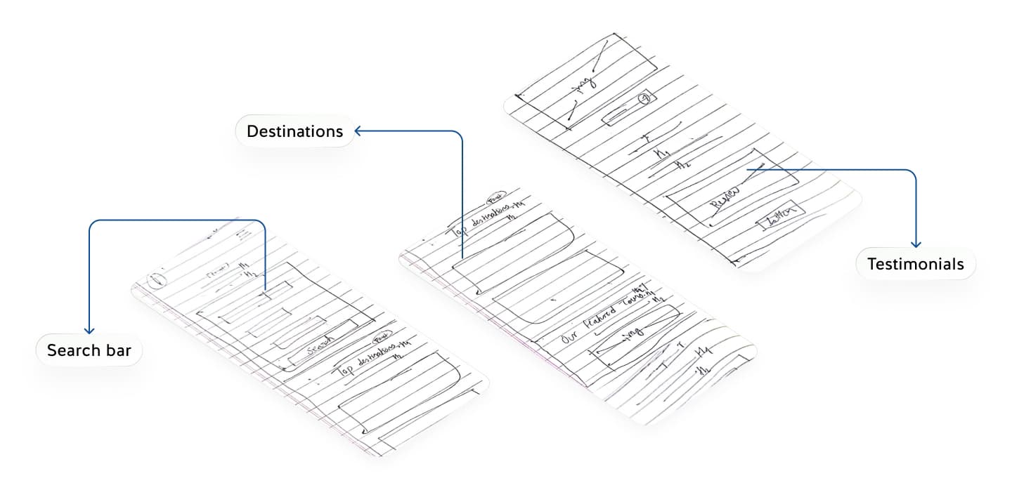
Low-fidelity wireframes allowed us to rapidly test different layout concepts and interaction patterns. We focused on creating intuitive navigation, clear visual hierarchy, and reducing the steps needed to complete a booking from 11 to just 4.
User flow diagrams mapped out every possible journey through the site, ensuring seamless transitions between browsing, comparison, and conversion. Special attention was paid to error states, loading experiences, and providing clear feedback at every step.
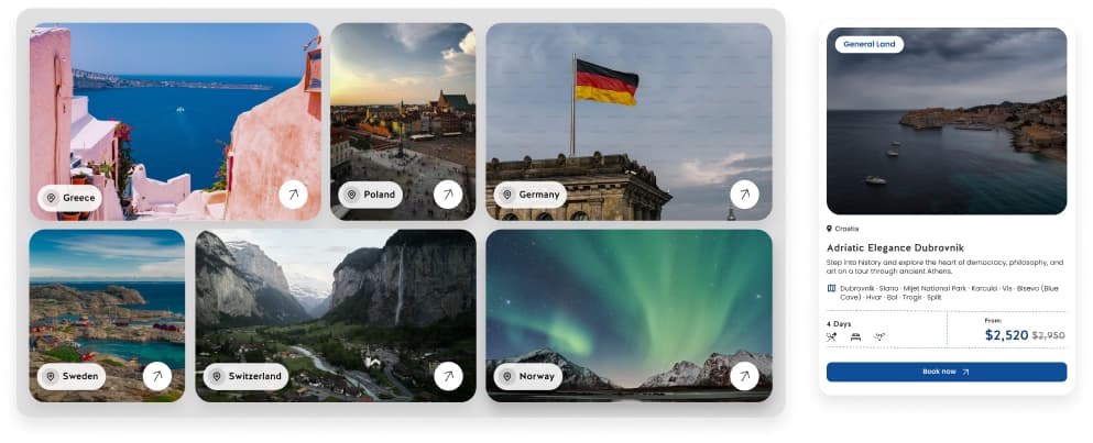
Browse destinations with advanced filtering and sorting
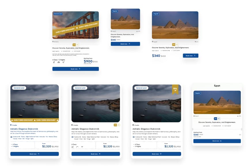
Side-by-side package comparison with clear pricing
Personalize packages with add-ons and preferences
Streamlined 4-step checkout with progress indicators
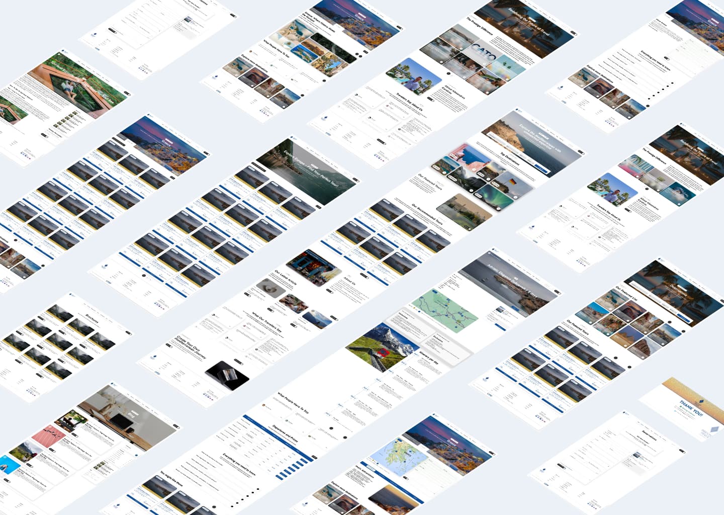
The wireframing phase focused on establishing the foundational structure for each page type. We created detailed wireframes for the homepage, destination pages, package listings, comparison views, and the complete booking flow.
Each wireframe was tested with users to validate our assumptions about information hierarchy, content placement, and interaction patterns. This iterative approach helped us identify and resolve usability issues before investing in high-fidelity design.
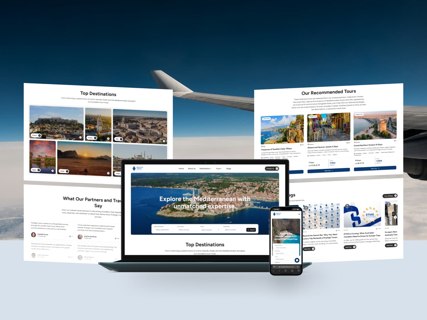
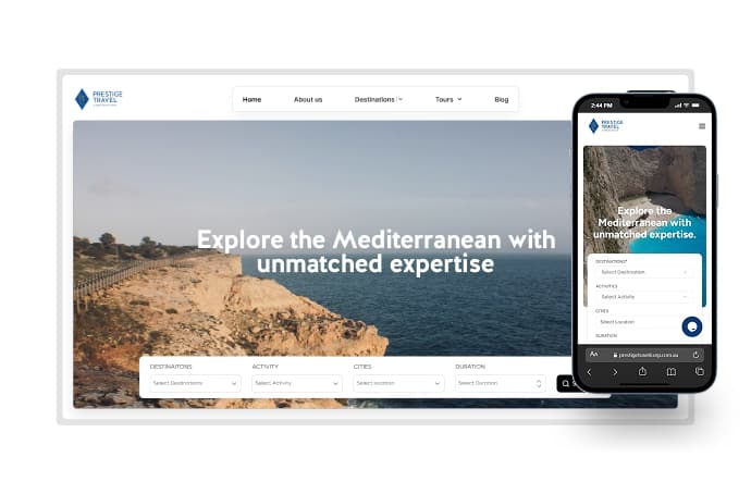
With validated wireframes, we moved into high-fidelity design, bringing the luxury brand to life through carefully crafted visuals. The color palette features deep navy blues and warm gold accents, evoking sophistication and trust. Typography choices prioritize elegance and readability across all device sizes.
Every component was designed with attention to microinteractions, hover states, and responsive behavior. Large, immersive imagery showcases destinations while maintaining fast load times through optimized formats and progressive loading techniques.
Color Palette
5 Core Colors
Typography System
3 Font Families
Component Library
64 Components
Accessibility was a cornerstone of our redesign, not an afterthought. We conducted thorough accessibility audits and ensured WCAG 2.1 AA compliance across all features. This included proper color contrast ratios, keyboard navigation support, screen reader optimization, and clear focus indicators.
Beyond compliance, we implemented inclusive design patterns: text resizing without breaking layouts, reduced motion options for users sensitive to animation, and clear, descriptive labels for all interactive elements. The result is a platform that serves all users with dignity and respect.
WCAG Compliance
AA Level
Accessibility Score
98/100
Issues Resolved
37 Critical
Interactive prototypes allowed us to test the complete user experience before development. We created clickable prototypes in Figma that simulated the entire booking flow, including dynamic filtering, package comparison, and checkout completion.
Three rounds of usability testing with 18 participants validated our design decisions. Users completed tasks 73% faster than on the old platform, with significantly higher satisfaction scores and a dramatic reduction in errors during the booking process.
Task Completion
73% Faster
User Satisfaction
+89%
Booking Errors
-64%
The final design system brought together all elements into a cohesive, elegant platform that reflects Prestige Travel Corporation's premium brand positioning. Every screen was designed to inspire wanderlust while providing clear, actionable paths to booking.
Responsive design ensures a consistent experience across desktop, tablet, and mobile devices. The mobile-first approach prioritizes the growing segment of travelers who research and book on smartphones.
The redesigned platform launched with immediate positive results. Within the first three months, Prestige Travel Corporation saw dramatic improvements across all key metrics. The booking completion rate increased by 156%, while bounce rates dropped to just 22%.
Customer feedback has been overwhelmingly positive, with users praising the intuitive interface, beautiful visuals, and seamless booking experience. The accessibility improvements opened the platform to a wider audience, demonstrating that inclusive design benefits everyone.
This UX/UI design case study demonstrates the transformative power of user-centered design. By prioritizing research, accessibility, and iterative testing, we created a platform that not only looks beautiful but genuinely serves users' needs.
The success of this project reinforces our belief that great design is measured not by aesthetics alone, but by how well it helps people accomplish their goals. For Prestige Travel Corporation, that meant turning browsing into bookings and transforming their digital presence into a competitive advantage.