Without the right context, AI design tools produce work that looks fine but could belong to anyone. A design system changes that completely.

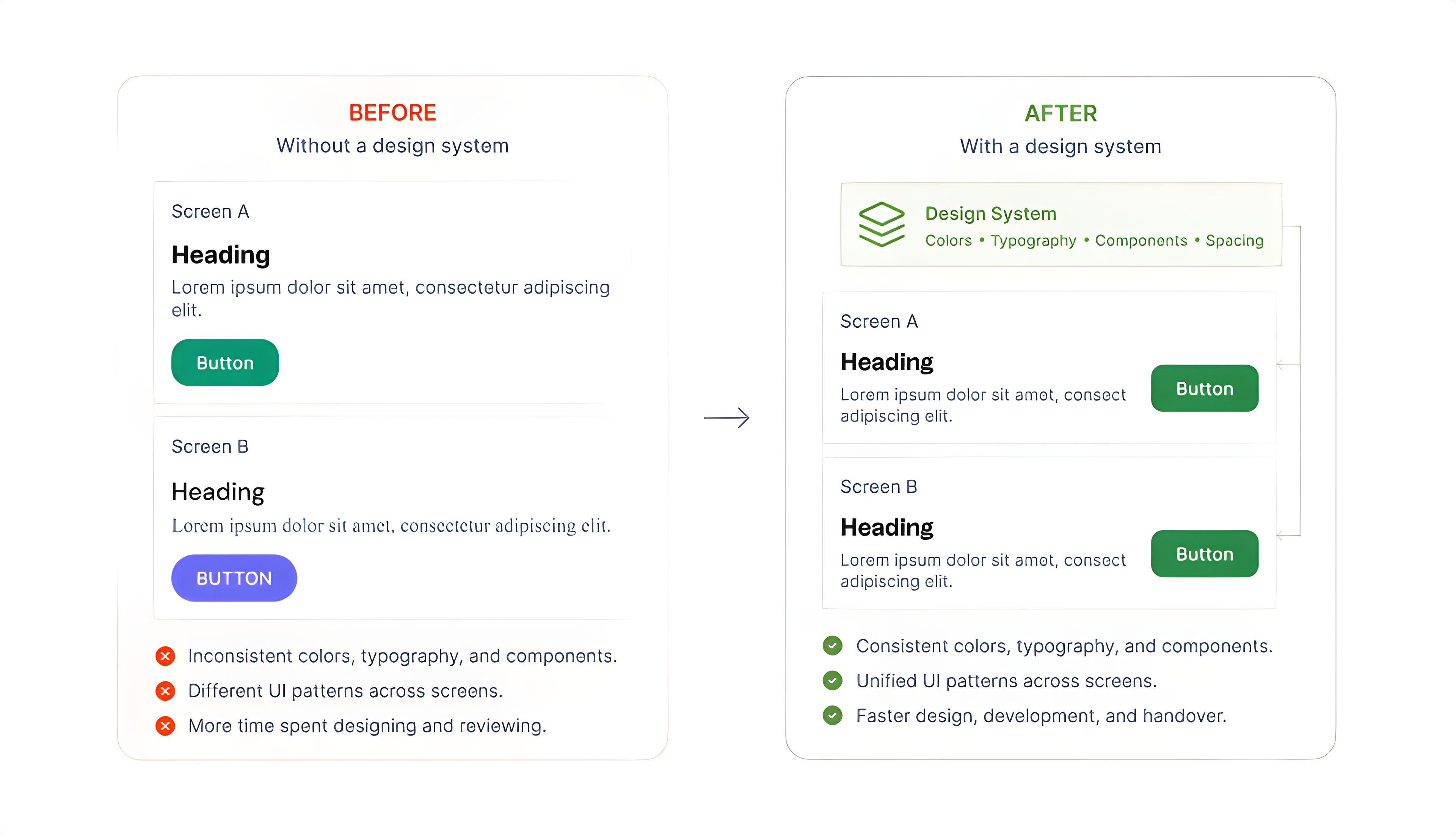
Ask an AI to design a dashboard with no brand context and you will get something generic. The button styles will be neutral. The typography will be safe. The colors will be inoffensive. It will not be wrong, but it will not be yours either.
That is not a failure of the AI. It is a failure of the brief. AI tools generate based on what they are given. When the brief is vague, the output is vague. A design system is the structured brief that closes that gap. The moment you give an AI your color tokens, your type scale, your component rules, and your spacing logic, everything changes. It starts making decisions the way your team would, not because it has gotten smarter, but because it finally knows the rules.
"The value of a design system has always been consistency. What's changed is that AI is now part of the team, and it needs the same documentation everyone else does."
A design system is a documented set of decisions. What colors represent the brand. How type is scaled. What components exist. How layouts are structured. How copy should sound. Every one of those decisions is something AI would otherwise have to guess at.
Think of it this way: when a new designer joins a team, you do not hand them a blank canvas and say "make something good." You give them the brand guide, the component library, and the tone of voice document. AI is no different. It performs best when it has that same foundation to build on.
| Design System Layer | What AI uses it for |
|---|---|
| Color Tokens | Applies the right palette instead of picking neutrals by default |
| Typography Scale | Uses correct font sizes, weights, and hierarchy rather than generic fallbacks |
| Components | Reuses existing UI patterns rather than generating new ones from scratch |
| Spacing & Layout Rules | Maintains consistent grid logic and density across generated screens |
| Content Guidelines | Matches the tone and terminology of the actual product |
The more complete these layers are, the less AI has to improvise. And the output looks like a real extension of the product rather than something pulled from a template library.
Claude Design by Anthropic is built around exactly this idea. Rather than asking you to describe your brand in a prompt every single time, it lets you upload the system once and uses it as the foundation for everything generated within your team. You do the documentation work once, and that investment pays off across every project.
It accepts a range of source formats:
The AI reads through all of it, extracts the visual language, and builds a working design system that persists across every project.
Once that setup is done, a prompt like "create a landing page for our product" stops producing something generic. It produces something that already uses the right colors, the right type, and the right component style, without needing to re-explain any of it.
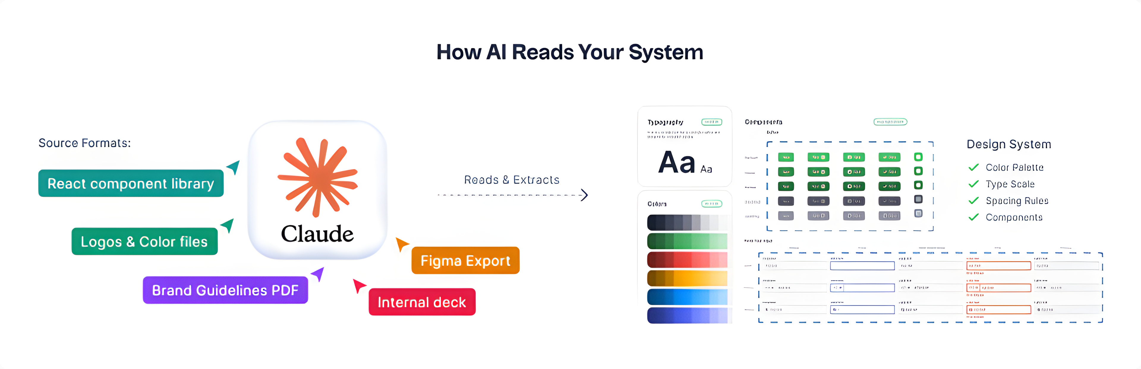
Here is a concrete example of what this looks like when the pieces are actually connected. A designer working with Claude Code linked it directly to a Figma file that had a fully set up design tokens library: colors, spacing, typography, corner radius, all of it documented as variables. Then, with a single prompt asking for an input selector component with variants, Claude got to work.
Ten minutes later, the Figma file had a complete component set with six state variants: default, hover, focus, filled, error, and disabled. Each one used the actual tokens from the library. Corner radius pulled from the radius scale. Colors came from the defined palette. Spacing followed the documented rules. It was not a generic component dropped into the file. It was something that already belonged in that design system.
The one thing it missed was applying the typography tokens to the label text, which the designer noted was likely because there was no specific token defined for that element yet. That is actually a useful signal: the AI will use what is there, and show you where the gaps are. In this case, it took about 20 minutes of manual cleanup, compared to the 20 to 25 minutes it would have taken to design the component from scratch. The difference was where that time went: instead of building, the designer was reviewing and refining.
"The AI will use what is there and show you where the gaps are. That is a different kind of useful."
One thing worth knowing if you try this: generating components through Figma MCP is token-intensive. In this example, a single component generation used about 30% of a weekly Pro plan allowance. For simple components that is manageable, but building out full pages or a complete component library will burn through tokens quickly. For that kind of work, a Max plan makes more sense.
It is worth being clear about something: the setup does not require a fully polished, enterprise-grade system. It just requires enough documented decisions for the AI to identify patterns. Here is how it works in Claude Design.
Pull together whatever already defines the visual identity. Figma libraries, a Storybook, brand PDFs, logo files, or even a well-designed internal presentation. One source is enough to get started. Multiple sources give the AI more signal to work with.
Claude analyzes the uploaded assets and generates a UI kit covering color palette, type scale, spacing rules, and component patterns. This happens automatically. No manual token entry required.
Run prompts that would normally produce generic output: "Design a pricing page," "Create a signup flow," "Build a settings screen." Compare the results against the actual product. Refine if anything looks off.
Once published, the design system applies automatically to every project created by team members across Pro, Max, Team, and Enterprise plans. One setup, consistent output at every scale.
The most immediate difference is speed. Generating a new screen, a new marketing layout, or a new component variant goes from a full design session to a starting point that is already on-brand. The AI is not replacing the design work. It is compressing the distance between idea and something worth reacting to.
Beyond speed, there is a consistency benefit that compounds over time. When multiple people on a team are generating with AI, the design system acts as a shared constraint, keeping outputs aligned even when working independently. Without it, every person's AI-generated work drifts in a slightly different direction. You end up with five screens that could each belong to a different product.
"The design system doesn't just improve AI output. It keeps AI output coherent across a team."
A design system tells AI what the product looks like. It does not tell it what the product should do, or whether a particular screen actually serves the user well.
Decisions about user flow, information hierarchy, what to cut, what to emphasize, and whether a design is solving the right problem, those still require judgment that no system can encode. AI with a design system is a faster, more consistent executor. The thinking behind what to execute remains a human responsibility, and probably always will.
If there is one thing to take away from all of this, it is that AI does not fail because of the tool. It fails because of the brief. A design system is how you fix the brief, once, for everything that follows.

About the Author
Rashi Maharjan. Rosie
Product DesignerLearn about our Editorial Policy.
WordPress 7.0 is finally here. Instead of just skimming the release notes or rehashing what other blogs already said, we installed it ourselves and spent real time poking around to see what actually feels different for everyday users. For this review, we set up the new version in a test environment and put it side by side with WordPress 6.x. Our focus wasn’t on deep developer internals, it was on the things website owners, editors, bloggers, agencies, and business users actually bump into while using WordPress every day. After living in both versions for a while, version 7 feels less like a brand-new platform and more like a cleaner, faster, better-organized WordPress. A few changes are useful right away. Others are more foundational and will probably matter more as later updates build on them.

Learn how ChatGPT ads work, who can buy them, how context hints target conversations, what the pricing looks like, and how to track results.
Seeing a 404, 500 or 503 error on your website? Learn what the most common website errors mean, how they impact SEO, and when it’s time to call a developer. You’re browsing a website, click a link and suddenly see a confusing message like 404 Not Found or 500 Internal Server Error. What just happened? Is it your fault? Is the site broken? Should you be worried? If you run a website, these errors can feel even more stressful. Will they hurt your Google rankings? Should you call a developer, or can you fix it yourself? This guide cuts through the technical noise. You'll learn exactly what HTTP status codes mean, why they happen, how they affect your SEO, and what you can do about each one, explained simply for website owners, marketers, and curious internet users alike.


